| Image Size
|
Change the Image size of the Gallery items.
Note: As the size of
images get large, more space is needed to display and scroll bars will be used.
|
| Display Style
|
- Navigation: Default
display style. Navigation mode enables options in the Captions group.
- Explorer: This mode
is similar to the Task menu mode used in previous builds.
|
| Captions
|
The Captions section allows for showing captions
(default) setting the location to Center, setting the Description as the
display and setting a restriction on the caption display.
- Show Captions:
Toggles the display of captions.
- Center Captions:
Sets the caption location to the center of the Gallery Item.
- Use Description as
display: Uses the defined description as the display for the Gallery Items.
- Size Restrictions:
Toggles the size restrictions for the display.
- Size: Sets the
maximum caption display size.
- Suffix: Sets the
suffix of the display when the size restriction is met.
|
| Recently Used Group
|
Toggles the display of the Recently Used Gallery
Group.
- Recently Used Items:
Sets the maximum number of items in the group.
|
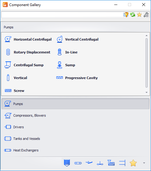
| Displayable Groups
|
Set the maximum displayable group in the gallery
control. These are the items that are below the Gallery control:
|
| Reset
|
Returns the Gallery Configuration values back to the
default settings.
|
| Save
|
Saves the changes and returns to the Component
Gallery.
|
| Done
|
Closes the dialog. User will be prompted to save any
unsaved changes.
|